
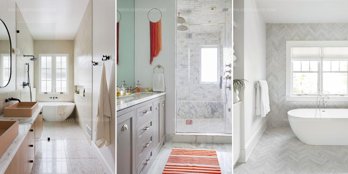
23 Minimalist Tile Ideas for Sleek Modern Spaces

Minimalist tile ideas can completely reshape how a room feels, bringing calm and clarity to spaces that once seemed cluttered or chaotic.
Clean lines and neutral tones work beautifully when you want a bathroom or kitchen that feels open rather than overwhelming.
Choosing the right materials means balancing simplicity with warmth so rooms don't feel cold or sterile but instead welcome and thoughtfully designed.
Subtle textures and careful grading create interest without busy patterns or loud colors competing for attention.
Large-format options stretch walls and floors visually, while monochromatic schemes provide cohesion that ties everything together seamlessly.
The beauty of less-is-more design lies in how it lets quality and craftsmanship shine rather than hiding behind excess decoration.
With so many ways to achieve serene and sophisticated spaces, you'll find plenty of inspiration to refresh any area of the home.
Basketweave Subway Tile Innovation
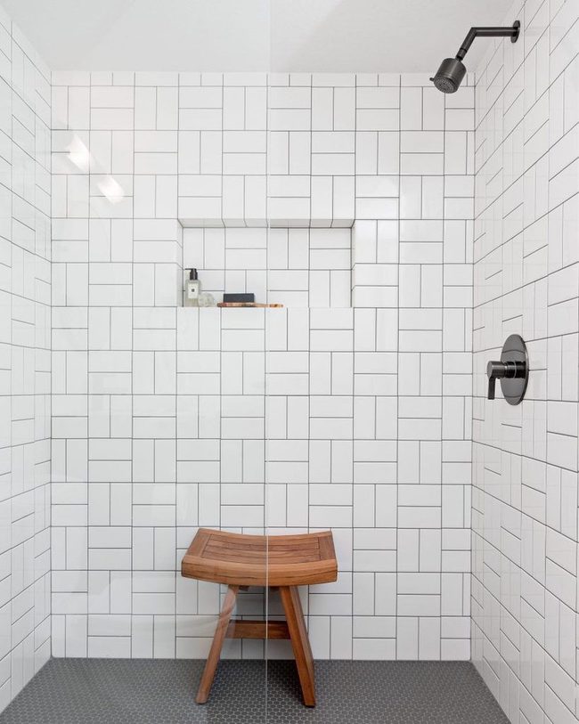
Subway tile has stayed popular for good reason-it adapts to nearly any style you're going for, and swapping out the standard running bond pattern for a basketweave design gives your space a fresher, more updated feel without abandoning that timeless appeal.
If you want to push things further, you could experiment with different grout colors to either blend seamlessly with your tiles or make them pop as a design feature.
Larger format tiles in the subway style also feel more modern than traditional small ones, and they reduce the number of grout lines across your walls.
You don't need to overthink this switch; sometimes the simplest changes have the biggest payoff.
Going with a geometric layout immediately signals that you've moved beyond the basic approach while keeping the clean lines that made subway tile beloved in the first place.
It's an easy way to refresh a familiar look and make it feel current.
Mirrored Grid Backsplash Sparkles
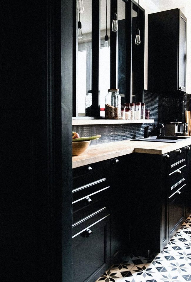
In this compact French kitchen, a small-square grid tile backsplash covers the wall behind the stove and instantly catches attention with its geometric pattern and reflective surface.
Light bounces off each tile and creates a sparkling effect that resembles polished gemstones scattered across the space.
You get that modern, streamlined look without sacrificing personality or shine It's a smart way to bring dimension to a tight cooking area.
Sometimes the smallest design choices make the biggest difference in how a space feels and looks.
Going simple with scale doesn't mean going boring, and this kitchen proves it.
Navy Tiles Graphic Kitchen Statement
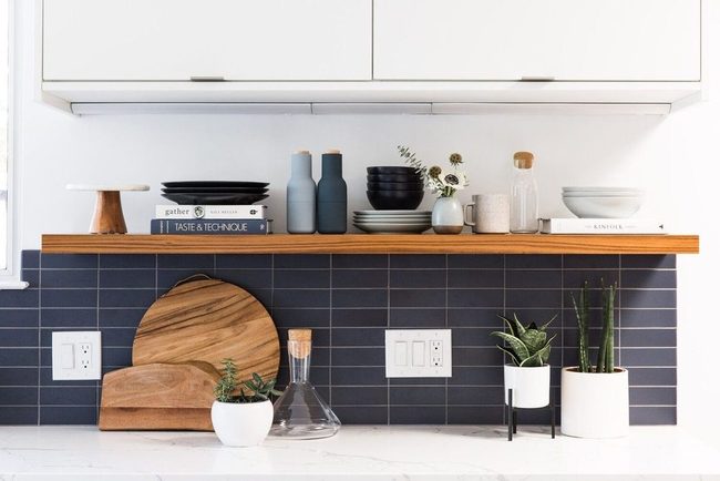
Horizontally stacked navy tiles create bold graphic lines and punchy color blocking that make your kitchen wall pop with clean, modern appeal and work beautifully with midcentury modern design principles.
Sleek floating shelves sit above this striking tile arrangement, emphasizing the streamlined look that defines this style.
Midcentury modern thrives on simplicity and removes anything unnecessary, so minimal tile treatments fit naturally into the overall aesthetic If you want to bring this style into your kitchen, consider pairing bold solid-colored tiles with equally minimal cabinetry and hardware.
Floating shelves above the tiles enhance that light, airy feeling since they don't clutter the visual space.
You can keep the rest of your kitchen uncluttered and let the tiles serve as the main design statement.
This approach keeps everything balanced and true to what midcentury modern is really about.
Subway Tile Meets Warm Wood Industrial
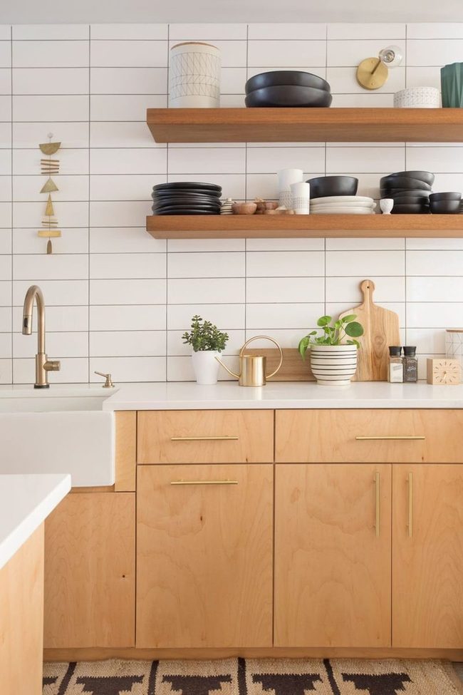
Horizontal subway tiles in a large scale cover the walls and grab your attention first, while metallic fixtures and white countertops give this plywood kitchen its modern, minimal edge.
Wood tones throughout the space keep things from feeling too cold and add natural warmth to the industrial design.
If you prefer a cleaner, less-is-more approach, this kitchen shows how simple materials and smart choices can feel both edgy and welcoming Sticking to just a few key elements means you can really see what each one brings to the room.
This style works well if you want your kitchen to feel contemporary but still grounded and comfortable.
Floor To Ceiling Marble Shower
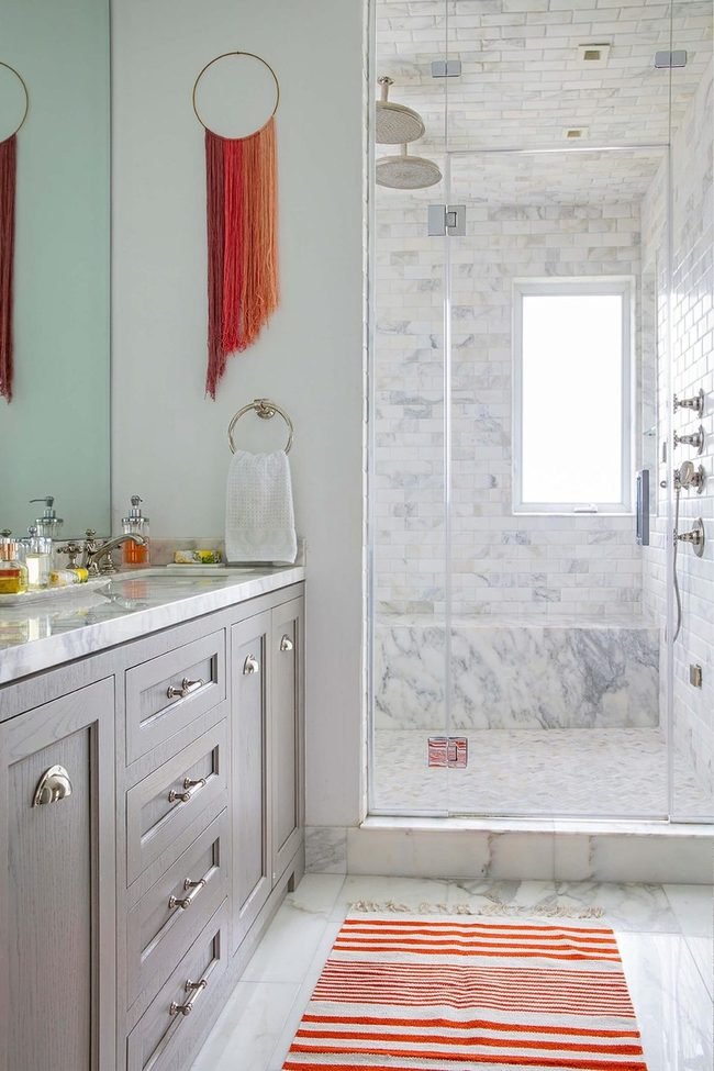
Large-scale marble tiles that stretch across your shower walls and overhead surfaces deliver immediate visual drama and set a luxury tone for the entire bathroom.
When you tile from floor to ceiling in a coordinated stone pattern, the continuous surface creates clean lines and makes the space feel polished and spa-like.
We often overlook the ceiling in bathroom design, but covering it with matching tiles transforms how the room feels and looks.
This approach, inspired by high-end designer spaces, gives you that resort-quality experience right at home.
Because marble naturally reflects light, you get brightness that bounces around the entire shower enclosure.
The result is a bathroom that feels indulgent and professional without requiring major renovations.
Covering overhead areas also makes cleaning easier and prevents moisture issues that can develop in corners.
You don't need an enormous budget to achieve this effect, since large tiles actually mean fewer grout lines and a simpler installation process.
Gray Tile Kitchen Statement
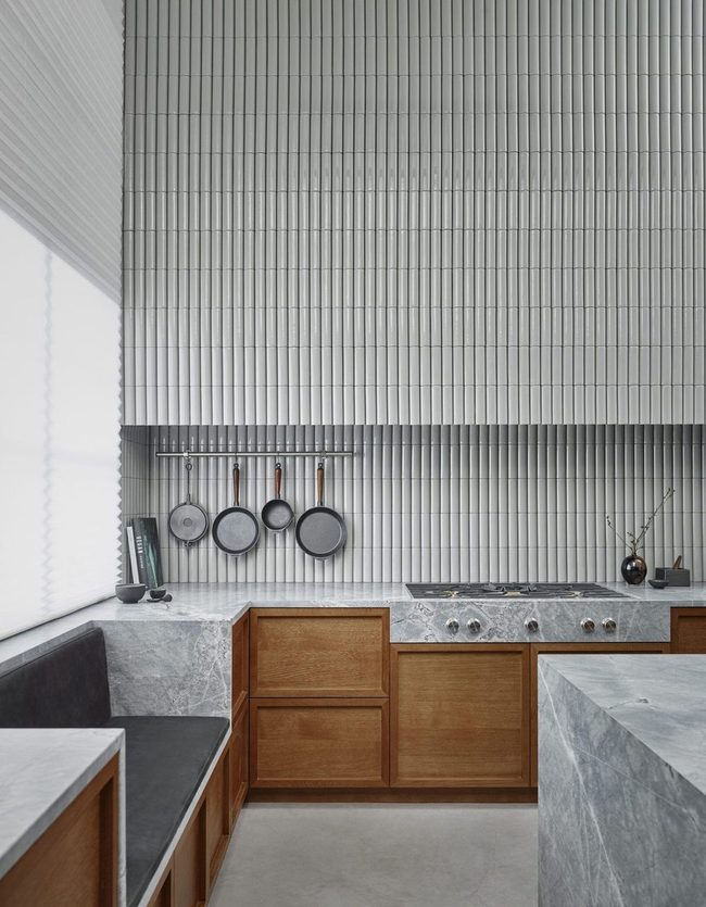
When you look at this kitchen designed by Liljencrantz Design, you immediately notice how the space balances between having lots of personality and clean simplicity.
What really stands out is the rounded gray tile that runs from the countertops all the way up to the tall ceilings, making the room feel both bold and cohesive.
We found this choice particularly smart because it guides your eye upward and makes the whole space feel connected rather than choppy.
Starting with the most eye-catching element, that continuous tiling creates a statement that you can't miss when you walk in.
Beyond the tiles, the design team clearly understood how to mix maximalist and minimalist ideas without letting one side overwhelm the other.
You get enough visual interest to keep things lively, but the layout stays uncluttered and easy to move through.
This kind of balance shows how good design isn't about choosing one style and sticking rigidly to it, and instead it's about knowing which elements deserve to stand out and which ones should step back.
If you're working on your own kitchen, this example shows that sometimes the most powerful move is letting one strong design choice do the heavy lifting for you.
White Penny Tiles Budget Luxury
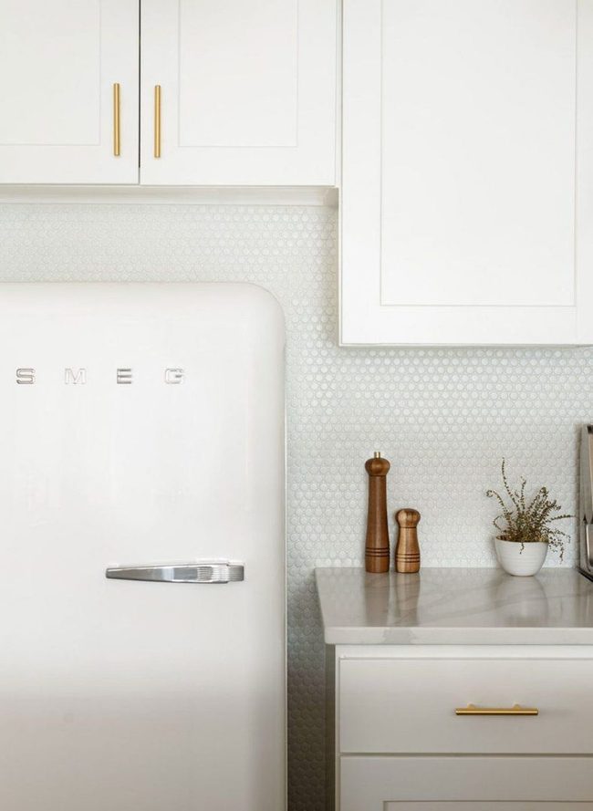
Penny round tiles across your kitchen wall make a stunning statement that doesn't cost much, and designer Desiree Burns proved this approach works beautifully in her all-white kitchen design.
Bright white penny tiles in an all-white space give the room a polished, high-end feel without breaking your budget.
When you choose an affordable tile option like this one, you free up money to spend on the elements that matter most to you, such as quality countertops and reliable appliances.
Small round tiles catch light differently than flat surfaces and add dimension to your walls.
You get the luxury look you want while staying smart about where your dollars go.
It's a clever way to balance style and savings in any kitchen renovation.
Tall Stretched Subway Tiles
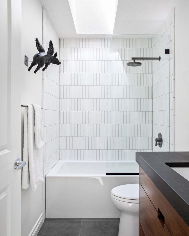
Long, thin tiles arranged in a vertical running bond pattern offer a fresh spin on the standard subway tile you might see everywhere, and these stretched versions genuinely make walls reach higher while the stacked layout keeps the look modern and unexpected.
We're drawn to how this variation breaks away from what's typical without losing the clean appeal that makes subway tile popular in the first place.
Vertical lines naturally guide your eye upward, so rooms feel more spacious and airy than they actually are.
By switching to this elongated format instead of the usual square or short rectangular shape, you shift the entire feel of a space without having to start from scratch.
If your bathroom or kitchen has lower ceilings, this tile choice helps solve that problem in style.
It's one of those simple swaps that proves you don't need to abandon a classic look to make it feel brand new and suited to your home.
Bronze Mirror Tiles Reflect Luxury
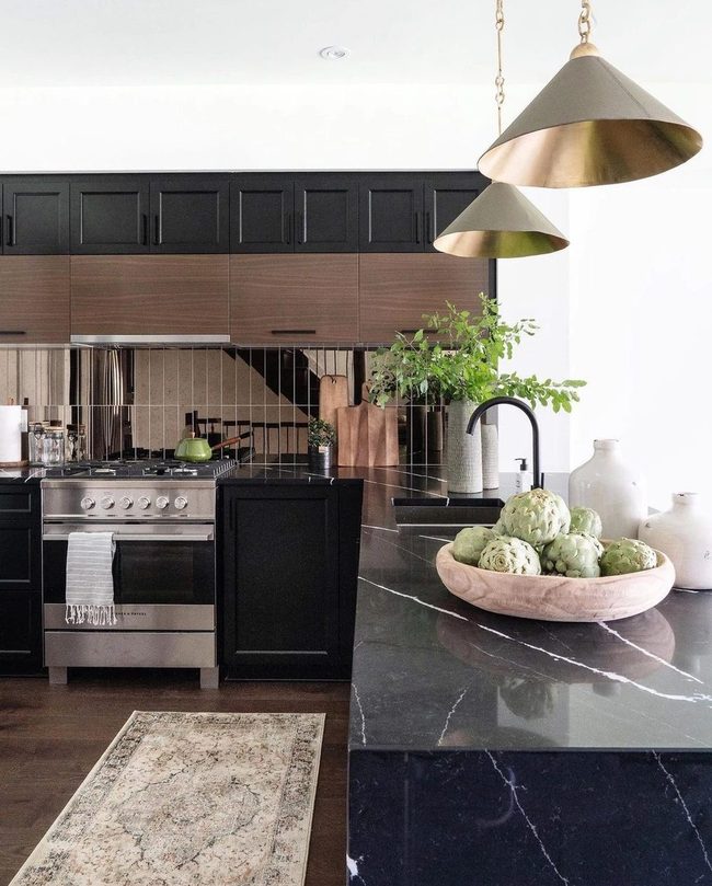
If you love minimal style but want luxury finishes, this kitchen from LeClair Decor shows how to nail that balance.
Bronze mirror tiles arranged in a vertical stack pattern climb up the backsplash and immediately grab your attention with their reflective shimmer.
Light bounces off the metallic surface and fills the entire space, making the room feel bigger and brighter than it actually is.
We think this one element proves you don't need much to make a kitchen feel sophisticated and upscale.
Keeping everything else simple and clean lets this backsplash shine without competing for attention.
It's a smart choice for anyone who wants their home to feel polished and modern.
So if you're after that luxury look without overdoing it, this bronze mirror solution gives you real polish and personality.
Black Marble Bathroom Tiles
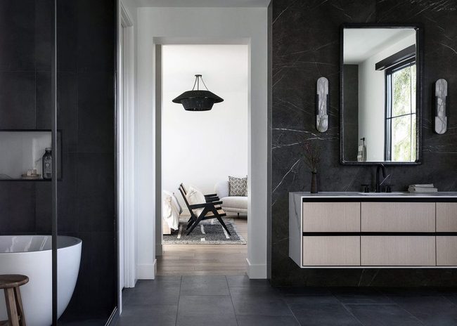
Bold black marble and stone tile dominate this bathroom's design, creating maximum drama through restraint and simplicity.
Designer Laura Brophy shows how mixing different materials works best when you stick to a limited color scheme, and her choice of nearly all-black surfaces proves that less can be so much more Think about how your tile choice relates to rooms nearby before you decide on anything.
Coordinating colors and materials across adjoining areas helps everything feel intentional and linked together.
You don't need busy patterns or lots of variety to make a space feel special; sometimes a single color family applied across multiple surfaces delivers more punch than anything else could.
This bathroom proves that restraint and material mixing can feel just as impactful as a heavily decorated room.
Looking at adjacent spaces guides your decisions and keeps your home feeling like one thoughtful composition rather than separate disconnected rooms.
Vertical Beige Tile Drama
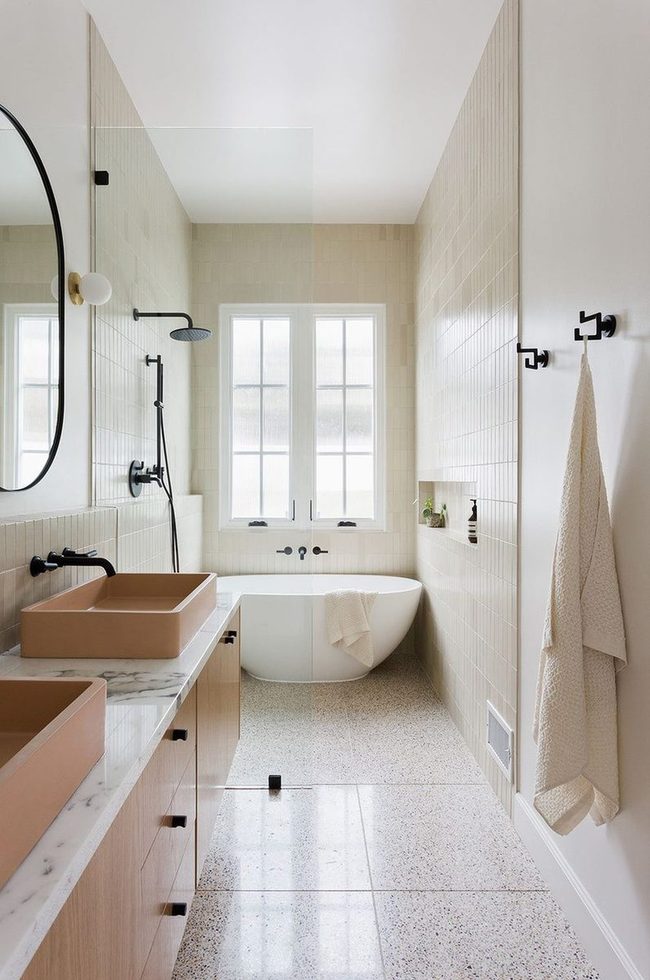
If you want to master color pairing, this peaches and cream bathroom shows exactly how it's done, and the vertically stacked beige tile that wraps around the entire wet room is what catches attention first with its dramatic scale.
Running those large tiles up the walls alongside the salmon-colored sinks and warm wood vanity creates a look that feels both balanced and bold When you're selecting floor and wall tiles for your own bathroom, remember that combining different scales makes everything look more sophisticated and intentional.
The way the neutral tiles frame those peachy sinks and wooden elements shows how well opposite tones can support each other rather than compete.
This bathroom proves that sometimes the most striking rooms come from pairing colors that seem unexpected but actually belong together.
If you're planning a bathroom refresh, pay close attention to how scale and color interact in spaces like this one.
Horizontal Marble Black Modern Shower
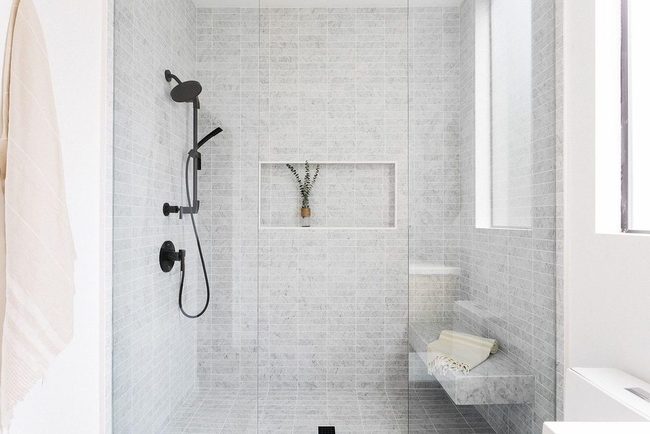
Marble gets a reputation as a fancy luxury material, but it actually works beautifully across many different design styles.
In this minimal shower stall, you'll see how horizontal marble tiles stacked one after another combine with a floating bench and matte black fixtures to deliver a sleek modern look.
You don't need to spend a fortune to get this effect either.
Mixing marble surfaces with simple black hardware gives the space a contemporary edge.
Each element-the tiles, the bench, the fixtures-comes together in a way that feels current and clean.
What's interesting is how accessible this style has become for everyday homes.
Whether you love modern design or just want something that feels updated, marble can absolutely get you there.
Your bathroom or shower can feel like more than just a functional room when you play with these kinds of materials and finishes.
Muted Zellige Terra-Cotta Dimension
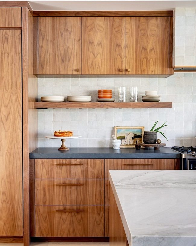
Moroccan Zellige tiles in muted shades like blue-gray or greige bring an immediate sense of sophistication through their deeply textured surface.
You'll notice how the glazed terra-cotta catches light differently across each tile, giving your space a layered appearance that feels anything but flat When you run your hand across these tiles, the uneven glaze reveals little valleys and peaks that add real dimension to walls or floors.
Because they're becoming more available, you can find them in sizes and colors that suit whatever aesthetic you're going for.
The earthiness of terra-cotta combined with the handcrafted quality of each tile means your space gains character and warmth naturally.
Even in a streamlined setting, these tiles hold their own and make the room feel thoughtfully designed.
Installing them gives you that sophisticated, lived-in look without demanding bold colors or busy patterns.
Gray Floor-To-Ceiling Tile Simplicity
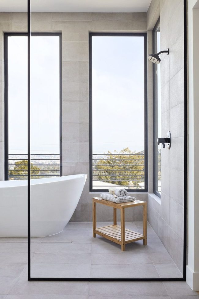
Expansive gray tile that stretches from your floor all the way up to the ceiling creates an unbroken surface that feels both sleek and open, and designer Cathie Hong recommends this approach as a straightforward path to minimal design.
Large-scale tiles are key here because they reduce the number of grout lines you see, which means fewer visual interruptions across the space.
When grout lines are nearly invisible, the whole room reads as one continuous plane rather than a patchwork of smaller pieces.
This unified look happens naturally when you choose bigger tiles instead of fighting with lots of little ones.
Repeating the same tile material everywhere removes the mental clutter that comes from mixing different finishes or textures.
You end up with a serene, uncluttered space that feels much more intentional without any extra work on your part.
Simplicity like this doesn't require a complicated plan-just stick with one material and let the space breathe.
Textured Brick Tiles Minimal Impact
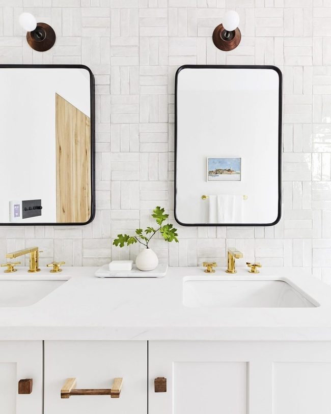
Brickwork tiles with their natural texture and depth can completely change how a bathroom or kitchen feels compared to plain subway tiles, and you can keep your minimal style while adding rustic charm to the space.
Swapping out those standard tiles for something with a bit more character gives your walls dimension that catches the light differently throughout the day Your space gets that warm, earthy quality that rustic design brings, yet it stays clean and uncluttered because you're not overdoing it with extra decor.
One pattern swap is often all you need to shift the whole mood of a room without fighting against a minimal aesthetic.
If you're looking for a way to add personality without filling your space with stuff, this tile choice does heavy lifting on its own.
Rooms with brickwork tiles feel more layered and interesting while staying organized and calm.
Black Stone Tiles With Wood Contrast
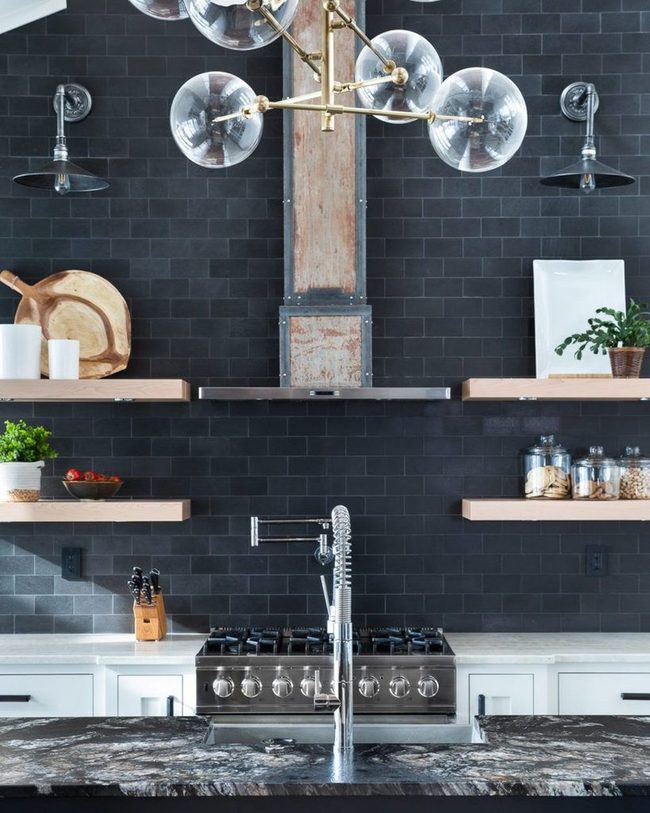
Black tile floors command attention in any kitchen, and we're here to tell you they never go out of style.
You'll notice how the natural color variations in black stone tile add depth and character to the space, making it feel less flat and more sophisticated.
Wood elements really stand out against that dark backdrop, creating a striking contrast that draws the eye, while darker metal accents seem to fade into the design rather than compete for your attention.
Designer Reena Sotropa understood this balance well and used it to shape the entire kitchen's look.
When you choose black tile, you're making a bold statement that works with almost any decor style you pair it with.
Metal finishes in darker tones keep the space feeling cohesive without overwhelming the senses.
This combination of materials shows that you don't need bright colors or lots of shine to build a kitchen that feels both modern and grounded.
Taupe Cabinets, Beige Zellige Walls
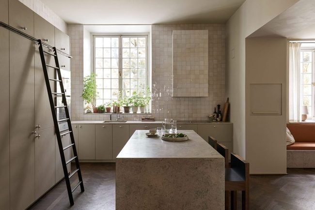
Beige-on-beige kitchens stand out as a refreshing break from the typical all-white or two-tone cabinet trend you see everywhere.
Liljencrantz Design proves that sticking with one color family can deliver stunning results in your own space.
Sleek taupe cabinets form the foundation of this approach, while beige-tinted zellige tiles on the walls add texture and depth without introducing competing colors You can still achieve visual interest through different materials and finishes rather than relying on color contrast.
Monotone schemes work especially well in kitchens because they make the space feel larger and more open.
If you're tired of the same cookie-cutter designs, this kitchen shows that embracing a single hue range can feel both modern and timeless.
Hot Pink Stacked Square Tiles
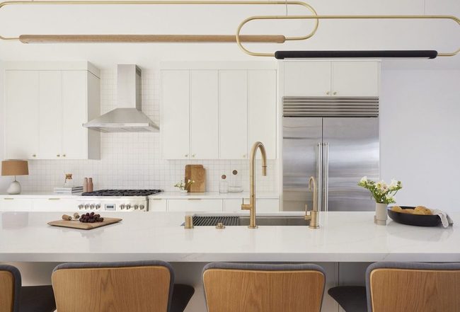
Bold stacked square tiles in small sizes make a stunning choice if you lean toward minimalism but still want your space to stand out, and picking them in hot pink, navy blue, black, or white gives you the freedom to add exactly the amount of punch you're after.
Whether you go with a daring hue or something neutral, these geometric shapes deliver visual excitement without overwhelming your room.
I love how this approach lets you keep things simple while still making a real statement.
You can mix and match colors across your space or stick with one shade for maximum impact.
Even a small room benefits from this kind of bold geometry since the tiles themselves do the talking.
Many people don't realize how much personality a single design choice can bring to otherwise plain walls or floors.
Picking sizes that fit your space means you avoid making the room feel cramped or cluttered.
Greige Herringbone Backsplash Statement
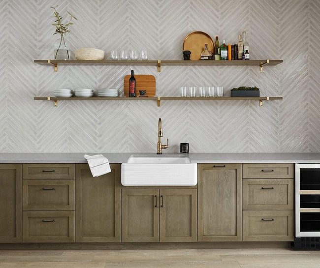
When you choose neutral tiles, you gain more room to experiment with bold patterns without making the space feel chaotic.
In this wet bar, a herringbone pattern in skinny greige tile creates an eye-catching accent wall that stands out beautifully.
Since the surrounding area keeps to neutral shades, this patterned backsplash becomes a statement piece that feels just right and doesn't overwhelm the room You can apply this same idea to your own space by starting with a calm color palette and then introducing pattern where it matters most.
This method keeps things balanced and lets you show off what you like without making everything feel busy.
Gray Tile Wall Statement
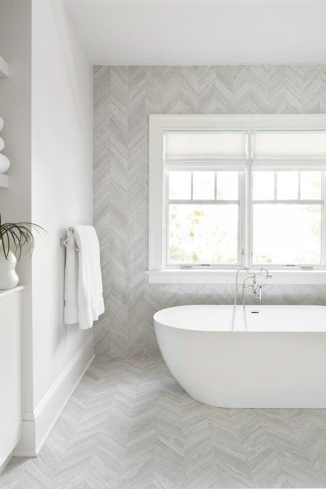
One way to add interest to your bathroom without overwhelming the space is to extend your floor tiles up a single wall, just like the homeowners did in this gray bathroom example.
By doing this, you get the visual impact of an accent wall while keeping things understated and modern.
It's a clever trick that adds dimension and texture to the room You can use the same tiles from your floor or pick a complementary option that plays well with your existing palette.
This technique works especially well in smaller bathrooms where you want to draw attention without making the space feel cramped.
It's an easy way to refresh the room without needing major renovations.
Pearly White Tiles Expand Small Kitchen
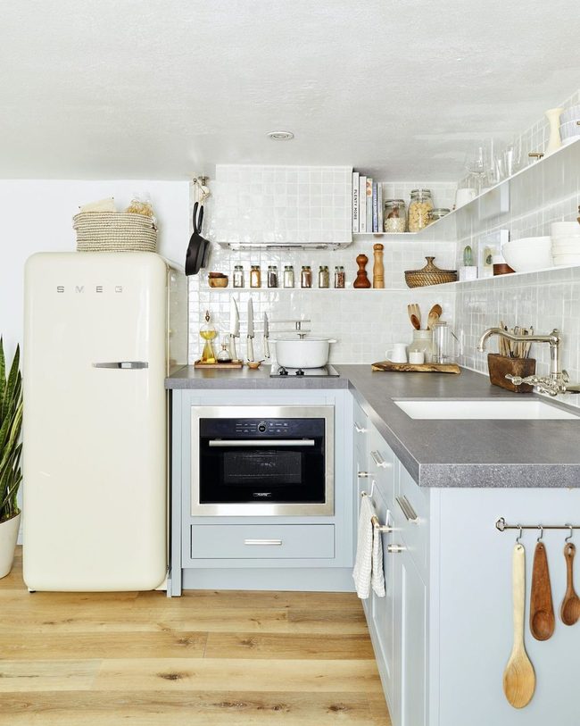
When you're dealing with a small kitchen, choosing tiles that almost disappear into the background becomes your secret weapon for making the space feel bigger and calmer.
We recommend going monochromatic here-pair white walls with pearly white tiles and white metal shelves so everything flows together seamlessly.
Your counter area stays understated and clean without visual clutter getting in the way.
Everything above the counter becomes a neutral stage rather than demanding attention.
Small spaces benefit from this restraint because fewer competing colors mean the room breathes easier.
Light reflects off all those similar tones and bounces around the space, which actually makes it feel more open.
You'll find that this stripped-back approach keeps your kitchen feeling refreshed and uncluttered.
It's a smart way to let minimalism work for you, not against you.
White Stacked Tiles Gray Grout
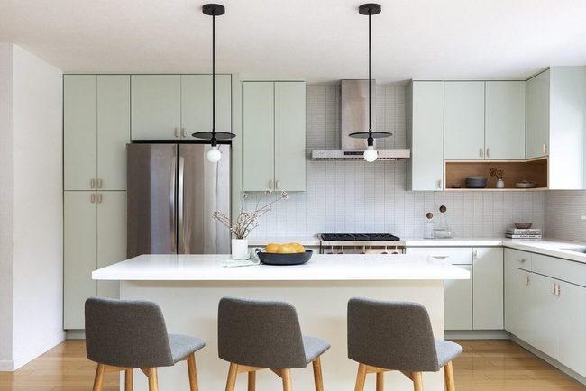
Stacked thin tiles make a smart choice for minimal spaces and work best when you pair them with clean lines elsewhere in the room.
Picture the way a white backsplash with gray grout catches light against minty cabinets in a modern kitchen-those thin rectangular shapes stack up and form a grid pattern that gives your walls real dimension.
You don't need much to add interest when you choose materials wisely, and these slim tiles prove that sometimes less space means you need to be more deliberate about what you include.
Gray grout lines between white tiles become part of the design rather than just something functional, and they help break up the wall in an organized, restful way.
Cool mint tones on your cabinetry play nicely with this neutral backsplash because neither one fights for attention.
If you have a tight kitchen or bathroom, this approach shows how thin stacked tiles and a simple color palette can still feel polished and current without overwhelming the space.
Oversized Tiles Seamless Minimalist Bath
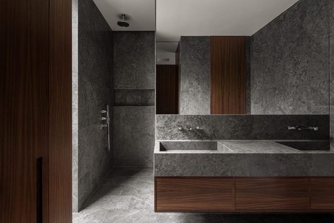
Liljencrantz designed another bathroom that will make any minimalist swoon, and it starts with those oversized tiles that stretch across the walls without interruption.
Stone countertops and rich wood elements run throughout the space, and they blend together so smoothly that you might not even notice where one material ends and another begins.
Chrome fixtures are mounted flush against the surfaces, and they disappear into the overall design rather than standing out Large expanses of unbroken surface create a calm, orderly feeling that makes the whole room feel bigger than it actually is.
If you want a bathroom that feels modern and grounded at the same time, this approach shows you how restraint and quality materials can work in your favor.
Everything from the tiles to the wood speaks to a philosophy of "less is more," and the result is a space that feels both peaceful and put-together.
Jasmine Lee
Content Creator & Style Advisor
Expertise
Content Creation & Engaging Writing, Home Project Ideas & Decorating Tips, DIY Projects & Creative Solutions, Trend Spotlights & Practical Styling Advice, Easy-to-Follow Guides for Home Decor
Education
University of California, Los Angeles (UCLA)
Jasmine Lee is a content creator and style advisor at Nesthance, making home décor feel fun and effortless. With a degree in communications from UCLA, she has a knack for turning decorating ideas into easy, step-by-step guides that anyone can follow.
She loves sharing practical styling tips, creative DIY projects, and trend insights to help readers refresh their spaces without stress. Her work focuses on making design approachable and inspiring for all.
Outside of writing, Jasmine enjoys discovering new design trends, attending workshops, and curating inspiration boards to keep ideas fresh and exciting.